
Designing a Login Form
When browsing the web one can see hundreds of all possible variants of user data input. But among those most popular are still web forms. No matter how much lazy we are to fill them in, we still need them.
Web forms are everywhere…but people hate them, I’ve got a friend who works in the tech support of a hosting company, he says that every day their department receives from 10 to 15 emails about errors in web forms. According to tech support, web forms are the nastiest things on any website. They break for no reason, and when they get fixed they break again.
If you’re designing websites, it’s likely forms will be there, whether it is a simple login/feedback form or a supercharged web application. In this article we’re not going to point out ways of solving all possible misunderstandings with web forms, we’re going to speak about the design of login forms. Here we’ve united 5 web form design concepts for designers/developers that are of great importance when implemented.
1. Plain forms
That’s simple as a pie. No need to rack your head over the design, cause most people don’t even care about how your form looks like. In this case, minimal style can “strengthen your hand”.

2. Enhanced with textures
Any possible design, no matter what it is, looks quite nice when the background is filled with some nice texture. It’s an absolutely awesome way to add visual interest to almost anything. A cool texture on a button can grab the user’s eye making them feel like they need to push it.
3. Enhanced with Illustrations
Who of you likes pretty illustrations, especially vector ones? Gotta be everyone. So why not add some animated vector bunny that hops somewhere around, thus attracting the attention of users.
4. Multicolored forms
Color psychology is a really interesting theme. Due to the use of this or that color or color combination, you can evoke various emotions in the user’s head. And also don’t forget about the fonts you’re using since their impact on users’ minds is as reasonable as the color.

5. Forms with visual separators
Any form is pretty boring, cause data input makes some people cry due to the complexity of the whole process. On the other hand, forms are not supposed to make people happy, their primary target is to be simple and directional. How do you think what can help us give direction to the forms? The answer is pretty simple: that’s straight lines. So let’s keep in mind the word direction and mix in some separators into the form design.
Now it’s time for you to spread some light on your design preferences when creating login forms. Use the comments section to describe them.
Related Post
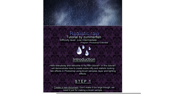
6 Water Drop and Rain Photoshop Tutorials
It’s time to share with you some cool stuff like useful tutorials.…