
Genius Web Design Features From 10 Leading eCommerce Businesses
Today Designers involved in building e-commerce websites face numerous challenges in attempting to build a great user experience. A successful eCommerce store is one that not only looks beautiful but also can create higher conversion rates and generate more sales than expected. If a user doesn’t like your site, he can move to another site to purchase products from, no matter how much low your prices are.
If you want to gain more potential customers, it is essential to provide your visitors with a beautiful and interactive user interface. To aid you in the process of designing a great eCommerce store, we’ve analyzed the best web design features of the world’s 10 leading eCommerce Businesses. You can include all these features in your next project to provide your users with a better design and great shopping experience or just choose ready-made Bigcommerce templates – whether they’re first-time users or returning customers.
Let’s go through them one by one.
Amazon
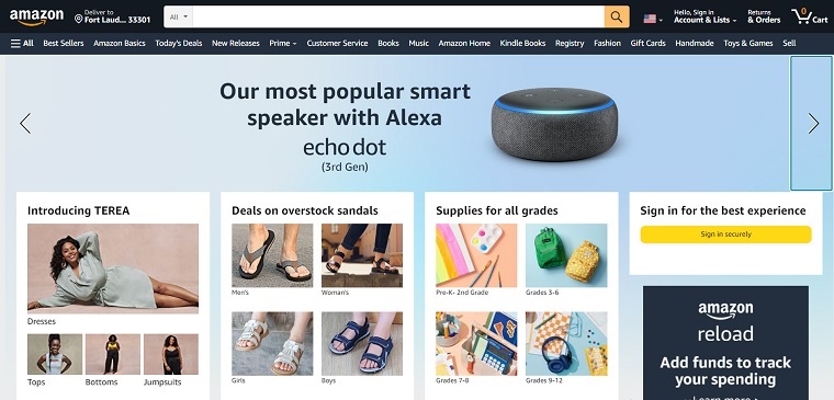
Since 1995, Amazon is the world’s leader in the field of e-commerce. The Amazon shopping experience begins on the home page, where it offers an extensive and intuitive navigation menu in the upper left, the search bar in the middle, and the account/shopping cart/wish list controls in the upper right. With these distinct elements, the users are able to quickly navigate between different categories.
In the sidebar located on the right-hand side, it displays “Best Sellers” of different categories, which are updated hourly. On the home page, it displays “Recently Viewed Items and Featured Recommendations” based on your prior activity. Below your recently viewed items, it features a slider containing 6 items per slide, which are bought by other customers who purchased similar Items in your recent history.
When you go through any product page, you can zoom in on the image of the product by rolling over it. Just below the product title, you can see how many customers have reviewed that product and how many questions are answered by Amazon executives. On the right-hand side of the product page, there are options for adding a product to your cart or buying with one click or adding to your wish list.
The best thing about the Amazon product page is that it gives you the option to add some extra items, which you may need after buying current product. For example, if you’re buying a camera, it’ll automatically suggest you add a Memory Card and Camera Case.
Godiva
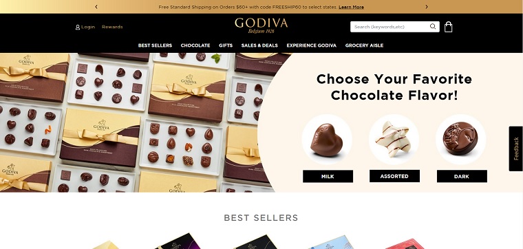
Godiva, a manufacturer, and seller of premium chocolates and other products have totally different and unique user interface. On the home page, it has a simple menu bar through which users can select their favorite category. A search icon is given on the right-hand side of the menu bar, which activates only when a user clicks on it.
It also features a beautiful slider that shows seasonal products. Just below the slider, a simple box is given where you can sign up for Godiva email and news.
Godiva’s product page is very simple than other eCommerce sites. Like Amazon, there’s an option to zoom in on the product image. Below the product, there’s a slider that suggests you buy products, which are related to your current product. The best feature of Godiva’s product page is that you can directly add as many suggested items to your bag or cart by using an “Add to bag” button given on the upper left corner of each item, without leaving the product page.
After selecting your products, when you move to the checkout page, there’s an option to choose whether you want to ship your order to a single address or to multiple addresses. This is the second most unique feature of this site, which is not available in most eCommerce sites.
On the checkout page, the development team of Godiva again added a “you may also like” slider that attracts users to add more products to their bags even during checkout. It can be considered a great feature of the Godiva checkout page.
ASOS
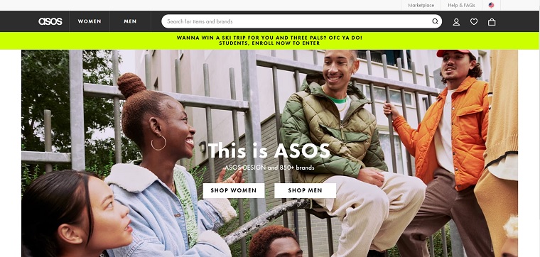
ASOS is one of the leading online fashion and beauty stores, which sells both its own range of clothes and fashion goods of other brands. The home page of ASOS has multiple text sizes and fonts, which creates a vibrant look and feel. ASOS developers created a clear global navigation that makes the initial selection process easy. The navigation is divided into two tabs, one tab is named Woman and another one is titled Man. When you select a tab, it produces a large drop-down menu through which you can discover a product by different options.
When you select a particular category, it displays all the products of that category in grid style. You can also refine all the products by style, size, color, price range, brand, etc. When you move your cursor on a particular product, it allows you to hide a particular brand or save that product for later, without leaving the page. It is one of the best features of ASOS eCommerce.
The product page of ASOS is very clean and simple. However you can’t roll over the image to zoom in, but there’s a zoom button through which you can view larger product images in a separate window. A “size guide” button is also given on the product button that helps you choose the correct product size for you.
LLBean
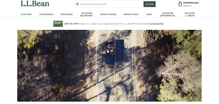
LL Bean is a mail-order, online, and retail company, which specializes in clothing and outdoor recreation equipment. On its home page, it features a menu bar containing several tabs, which create a drop down menu when you take your cursor on a tab. A search bar is also given just above the menu bar using which you can search a product by entering name or keyword. You can also check your wish list directly without leaving the home page and move to your shopping bag/cart, using the links given above the right corner of the menu bar.
The category page of LL Bean is a little bit different from the category page of other sites described above. A lot of options are there to help you in the process of selecting your favorite product. For example, you can sort your product by price, best-selling, newest, customer rating, and A-Z. The multiple-view system allows you to view the products in different styles like grid, micro, list, etc. There is a “quick view” button on each product that lets you have a quick look at that product without moving out of the category page. An “Add to compare” button is also given below each product using which you can add a product to compare list.
LL Bean allows you to compare 4 products at a time using a pop-up, so there’s no chance to lose your category page during the comparison process. The product page is very similar to ASOS, except for the feature “Frequently Purchased Together” products.
Nordstrom
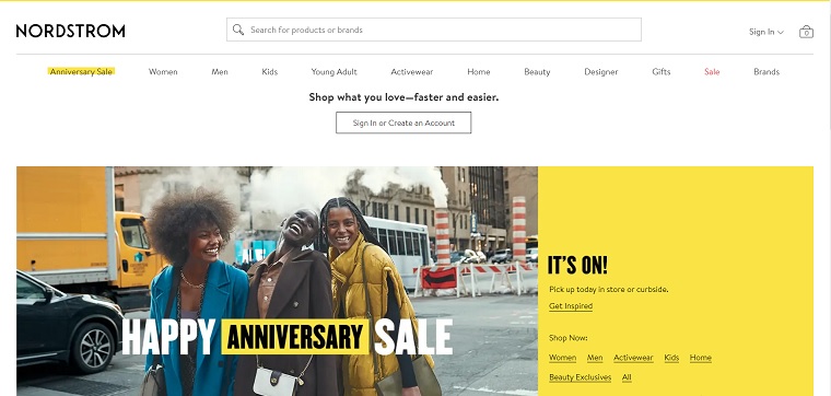
Nordstrom, an upscale fashion retailer, also has a clear navigation system like LL Bean and ASOS. On the home page, it displays featured products from different categories. Its category page is very similar to LL Bean, except for the feature “Store Availability” which enables you to check the availability of stores within 5-100 miles of your ZIP code. The best thing about its category page is that you can view a product in different colors, just by moving your cursor on given colors. However this feature is also available in LL Bean, but you’re required to click on available color options in order to view a product in different colors.
On the other hand, the product page offers you two different options to view product images. You can either zoom in on a certain part of the product image by clicking on it or open the image in a new window to view it larger. Apart from this, the product page also offers a “Live Chat” option, in case you require any type of help related to the current product.
Gap
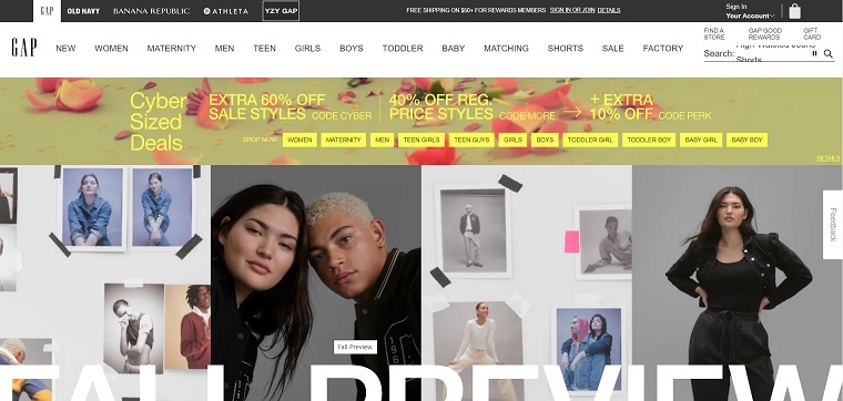
Gap, founded in 1969, is an American clothing and accessories retailer. On the home page, it displays new arrivals and products from different categories. It offers a simple menu bar that contains direct links without any drop-down menu. When you click on a link, it takes you to a new page where categories are displayed on the left-hand side of the page.
After selecting a category, you’ll be redirected to the category page where items are displayed in grid style. The category page lets you sort items by style, size, color, price, etc.
Like Nordstrom, Gap’s product page also offers two options to have a better view of product images: roll over the image to zoom in and view it larger in a new window. The best feature of the product page is that you can have a “quick look” at all recommended items displayed in the sidebar. If you like an item during the quick look process, you can add that item to your cart without leaving the product page. A “Find in Store” option is also there through which you can check stores near you for a product.
Victoria’s Secret
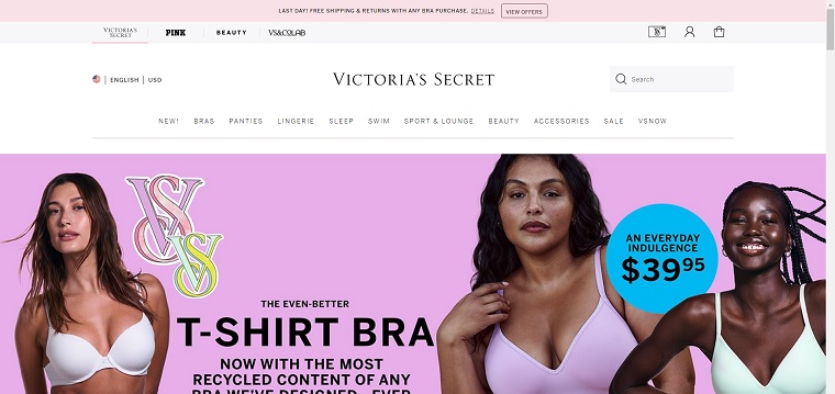
Founded in 1977, Victoria’s Secret is the largest American retailer of lingerie, Womenswear, and beauty products. The home page of this site is very similar to Gap, which displays different sections in the menu bar without any drop-down menu. On the home page, featured items or products from different categories are displayed in grid style. When you click on a section in the menu bar, you’re redirected to a new page where categories of that particular section are available in a vertical menu on the left-hand side of the page.
When you choose a category, you can view products in the grid style. The category page lets you filter items by size, style, and color and you can also sort products by different categories. Like LL Bean, a “quick view” button on every product is also available through which you can view a product in a pop-up window. There is another button titled “Love It” on the upper right corner of every product that lets you add your favorite item to your wish list.
The product page of this site is very simple, clean, and attractive. Though there’s no option to open the product image in a new window, you can zoom in a certain part of the image by clicking on it. One of the unique features of its product page is the “Add More at a Time” button. Using this button, you can add more than one product at a time by selecting different sizes, colors, and quantities.
Proflowers
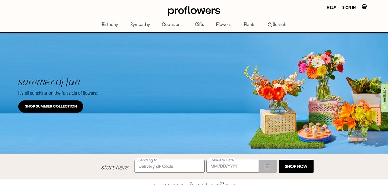
ProFlowers, founded in 1998, is a major flower retailer that sells its own distribution facilities and products shipped from suppliers and growers. The home page of this site offers a horizontal navigation bar that contains several tabs. When you move your cursor on a tab, it creates a drop down menu where you can select your category.
The category page is very simple and displays items in grid style. Unfortunately, there is no option available to sort or filter items as per your requirement. The product page also lacks an image zoom-in feature, so you can’t expect to have a closer look at a product. For user convenience, it displays recommended and recently viewed products in the sidebar. You can also use “Frequently Asked Questions” to clear your doubt about delivery or any product. This “FAQ” section given in the sidebar can be considered the most unique feature of the product page.
Staples
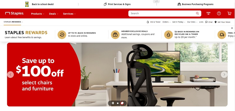
Staples is the largest American supply chain store, which sells office machines, supplies, furniture, promotional products, technology, and business services. The home page of this site features a slider, which displays promotional or seasonal offers to visitors. There is a search bar in the upper left corner of the home page that is totally different from other sites in this list. When you type something in it, it dynamically gives you appropriate suggestions (like Google) through which you can directly jump to your favorite product or category. One of the greatest things about its home page is that you can directly add any product to your cart without going to the product page.
The category page allows you to view products in two different styles i.e. list and grid. A number of options are given to narrow your search according to your requirements.
You can even compare up to three items at a time, without leaving the category page. During the comparison process, an option is also available that highlights major differences between the compared products. It helps users easily decide which product is best for them to purchase.
QVC
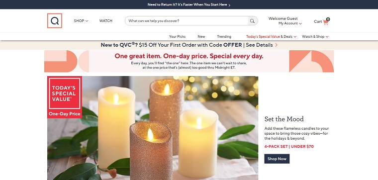
QVC, founded in 1986, is the world’s most popular video and eCommerce retailer that offers a curated collection of different brands to their customers globally through the internet, broadcast, and mobile sales platforms. The home page of its website offers a horizontal menu bar containing several tabs, which expand to a large drop-down menu when you take your cursor over them. It also features a slider that displays featured products. A search bar is also given just above the right corner of the menu bar through which you can search a product by keyword.
Like Staples, the category page lets you view items in three different styles: gallery, list, and text only. Though you can compare up to four products at a time, but you’ll be redirected to a new page during the comparison process, which means you’ve to leave the category page to compare the products. Also, there’s no option to highlight differences between products.
Related Post
jQuery Floating Menu Plugins – Keep Your Menu at Hand
Nobody will prejudice against the fact that navigation is utterly important for…