
Logo Design Best Practices to Stay on Top
Because a logo reflects the essence of a brand, a unique and custom logo is immensely important for branding. It’s an important constituent of brand building.
Logo design practices are constantly changing. We are in the middle of 2022 now, and the logo design best practices to stay on top of things are
Color selection
It’s unfortunate that colors are underrated. Colors are among the key aspects of branding. A research carried out by University of Loyola, Maryland shows colors can escalate bramjnd recognition by a whopping 80%. Besides, colors have psychological properties to them.
Top brands understand the role of color psychology for logo design. Below is an infographic showing how they are using color in logo design:
Facebook’s trademark color is blue, Nikon has yellow and black in its logo. BlackBerry’s color is black, which fits its name. All these brands logos have colors that are somewhat connected to their brand identity.
Selecting a suitable color for your brand is important, but don’t rush things up and pick an inappropriate color. Think of your brand’s personality and the theme of your business. Then select a color accordingly.
Font selection
Earlier, font selection was moderately important in logo design. Lately however, its importance has skyrocketed. That’s chiefly because a growing number of users are now accessing the web from Smart devices which makes it difficult to notice certain fonts.
Using a large font is not a solution to this problem because then the browsing experience could be troublesome for those who access the site from desktop devices. The fonts might break the width or the lines.
The font needs to be stylish, but not overly stylish. A soothing font gives off a pleasant feel whereas an overly stylish font looks unnecessarily gaudy. Select a font that falls in the middle. Another thing, while the multi-screen environment is a serious consideration, don’t forget that your Logo could be used in printed materials. The font needs to look attractive in print format.
Minimalism rules
Minimalism is the new mantra in logo design. Designing a minimalist logo is damn easy because the logo doesn’t have too many details in it. Right?
Wrong. Even though there’s a lack of details, but creativity needs to compensate for it.
See the two logos below:
Mama Logo Template
Elegant Letter H Logo Template
Both logos are minimalist and very good at it. There’s no extra word, no additional brand message, nothing. Only slight tweak of letters so the logos appears meaningful.
Some consider minimalism the gold standard for designing. Surveys also reveal that people prefer simple logo than flashy ones. In case you find it too extreme, at least make sure the minimalist theme is present in the logo. Minimalism is often dubbed as design around the content, causing the onlooker to focus on the content.
One surprising benefit of minimalism is it lowers the project cost. Logo designers often have to redo their work and this way, they digress from the original DFD. This sometimes increases the project life-cycle. That’s why, some designing companies use job costing software to calculate the extra cost. Minimalist logos are seldom rejected because of simplicity.
Brand storytelling
Brands are donning a new avatar – one that enables their audiences to relate to them. This new avatar is called the humane avatar. The new era in branding is called the “human era.” The idea is a brand will project itself as a human being to reach close to potential buyers (and non-buyers alike).
A logo tells a brand’s story. It contains emotions and the signature of the brand. A logo’s uniqueness carries the brand signature. The best part of emotions that a logo expresses is they titillate people. Because the relationship between the two is somewhat abstract, people interpret brand logos according to their own tests and tenets.
A good story shares the same characteristics. The story remains open to interpretation, yet sends a strong message to its readers. Even though logo is critical to the formation of a brand story, it is not the only aspect. There are other aspects such as toggles, date and time pickers, list boxes, radio buttons, fonts, images, etc. There should be a coherence between the logo and these aspects.
3D logo
Animation, gaming and interior designing are among the industries that 3D has started to revolutionize. Logo design has hitherto been left out, but 3D has begun to make inroads.
A 3D logo looks realistic. The realism introduced by the logo can help personify your brand. Now this might sound counter-intuitive to you as flat design doesn’t aim for realism, rather nonrealism. Realistic design was a characteristic of skeuomorphism, which is 180° opposite to flat design. Apple has embraced flat design and gotten rid of skeuomorphism when iO7 user-interface was designed.
However, 3D doesn’t necessarily mean skeuomorphism. There are minimalistic 3D logos that are eye-catching and at the same time realistic, like the one below:
Elegant 3D Wave Logo Design Template
Unlike a 2D logo, a 3D logo is made of two parts – modeling and texturing. The modeling may not be entirely perfect, especially if open source tools like Blender are used. But glossy texturing can make up for the shortcomings. This makes it easy on the part of designers.
Be prudent with space
Space-saving is a new trend and becoming popular in next to no time. The negative space technique is a space-saving technique. Remember the optical illusions, such as the one below:

The white space in the image above resembles a lamp. The Negative space utilizes the same hack. Look at the NBC logo below:
The logo is simple, minimalist, and the white space takes the form of a peacock to the naked eye. The FedEx logo below is yet another example of negative space:
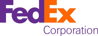
Put your attention on the right area. Can you see an arrow mark there? The bottom portion of the letter E and the right side of the letter X create the arrow mark.
Negative spacing and other space-saving techniques can allow you to unleash your creativity without needing extra space.
Conclusion
Designing, especially logo designing requires creativity and imagination. The more you think out of the box, the better design ideas you will produce. The tips discussed here can help you implement those ideas.