
How to use Media Queries for Responsive Design
A guide to creating pages that display correctly on a range of viewing devices Media Queries have long been considered a bit of dark art by a large number of web developers, but since the appearance of CSS3, they have actually been relatively simple to implement.
Media Queries check devices that are attempting to view your content for certain features which will determine the way the content must be viewed, and implement this accordingly. Tablet, desktop, or phone – your website has to be viewable on each.
A notebook is likely to have different viewing and interaction requirements to a tablet PC. Here’s a short summary of how to use Media Queries to make your website easily accessible to all.
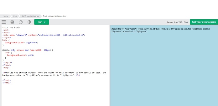
The first rule for usage media Queries is to include a block of CSS properties only if a certain condition is true. For instance, If the browser window is 600px or smaller, the background color will be lightblue:
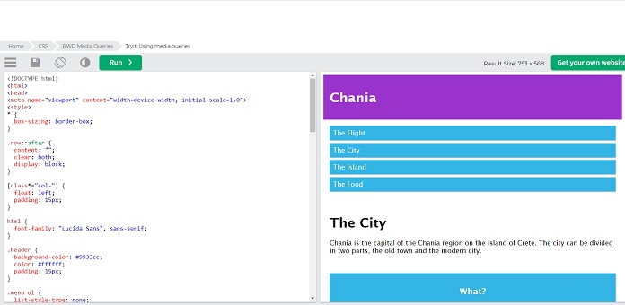
Many websites do a lot of pages with rows and columns for different questionnaires and so on. However, they wouldn`t look great on small screens. And on the other hand, if you create a website for mobile devices with a certain height and width of the screen, then it will look terrible on desktops or tablets.
To avoid such a problem, you need a Media Query that will help you change the design to the best one for the given screen size. This approach means that it doesn’t matter what the exact dimensions are of the device being used, every range is catered for. The points at which a media query is introduced are known as breakpoints. You could also add as many breakpoints as you like.
Design for mobile first
What is mobile-first? This is the development of a site or page, first for the screens of mobile devices, and only then for computers and other electronic devices. This method will speed up the display of pages on devices with a small screen. To do this, you need to make some changes to your CSS.
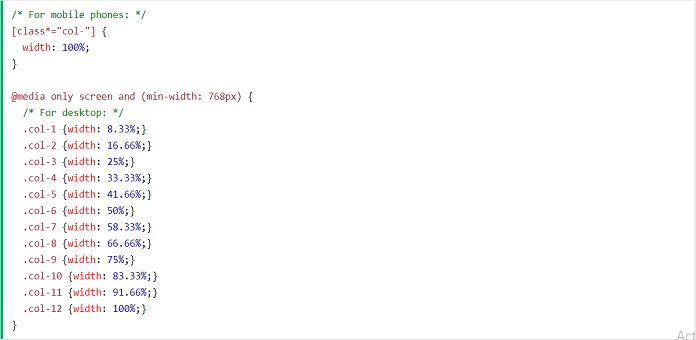
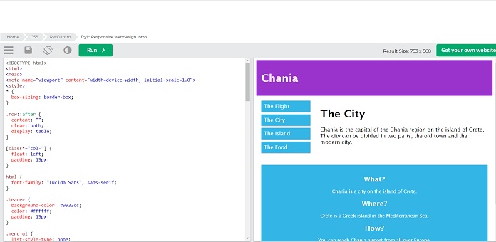
Two sets` obviousness of identical classes gives us the opportunity in HTML to decide what will happen with the columns at each breakpoint:
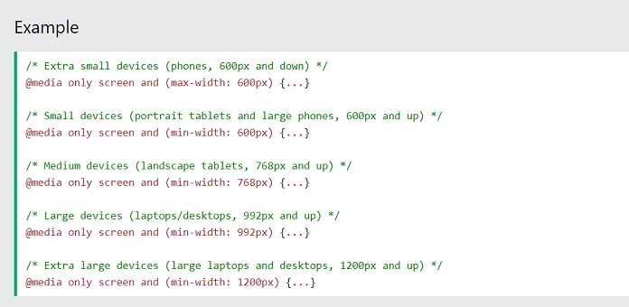
There are thousands of electronic devices with different heights and widths. Of course, it is hard to create an exact breakpoint for each device. So, you could just target five groups:
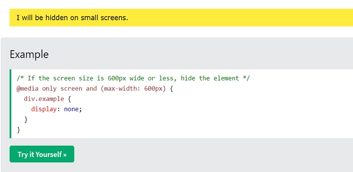
With help of Media Query, you could hide some elements on different devices. So you just need to write the size of the screen where chosen elements should be hidden.
By following these steps, you can add progressively complex Media Queries to your website. And make sure that your design is fluid and responsive on all platforms.
Related Post
Best Free and Premium Blog HTML Templates
Blogs abound on the internet. Some of them are established, others are…