
Essential Toolkit for Responsive Joomla Web Design
As many Internet users advance by using mobile phones and tablets for surfing the web, developers must adapt and make their sites responsive to various devices. The goal is to create a pleasant user experience for all visitors no matter how they choose to access the Internet.
In order to keep up with the growing trend of mobile access, the Joomla community has created dozens of tools with responsive design in mind. The CMS’s frameworks, templates, and extensions simplify the process of turning your website into one that is mobile-ready and accessible to all users. Before we start, check out what you know about responsive web design.
Responsive Frameworks
Joomla’s T3 framework
This features multiple themes and layouts to offer designers the flexibility of creating customized websites. The tools, plugins, and templates for T3 are user-friendly for a quick and simple design. This framework automatically detects the user’s device and compensates for optimal viewing. Anyone who has ever tried to access a non-responsive site from a mobile device knows how frustrating the panning, scrolling, and resizing can be.
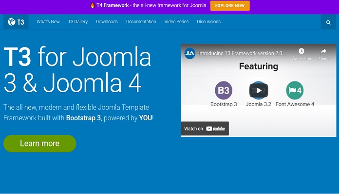
T3 framework alters the layout of each page for a more pleasant viewing experience. Multiple-browser support also ensures an optimal presentation for all users whether they are using a Mac, PC, or mobile device.
JA Elastica
It is a responsive template developed in the T3 framework. The template adapts to fit any screen size, such as wide monitors, iPads, and Android devices. Web pages support both portrait and landscape views for mobiles and tablets.
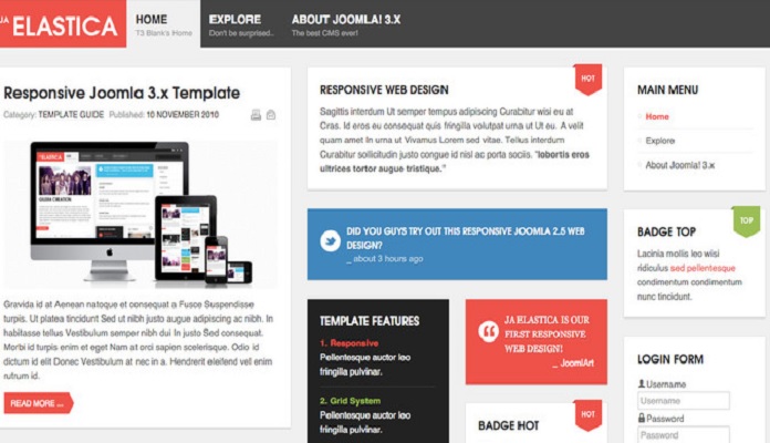
With the built-in source detection, your layouts adapt to one of five options, which are normal, wide, extra-wide, mobile, and tablet. Your web pages will be compatible with the latest versions of Chrome, Internet Explorer, Firefox, Safari, and Opera. As a responsive template, JA Elastica also supports mobile browsers.
Web designers can create entire websites with responsive pages using this single template for everything. JA Elastica features multiple modules, badge styles, and menu options that give designers the creative freedom to develop websites as they imagine. Advanced users can even define their own module positions outside of the T3 defaults for ultimate customization. All fonts, images, logos, and media typographies are completely responsive to any device and browser.
Joomla’s Zen Grid
This framework was created specifically for responsive design. Its fixed and fluid layouts adapt on a percentage grid after detecting the source. Media queries respond to the user’s browser to ensure compatibility. One of the more intuitive features of Zen Grid is that this framework exists as a plugin for more convenient access to your templates. Visitors using older devices as well as those using the latest technology will be able to load pages faster due to caching and file compression, which reduces the number of http requests.
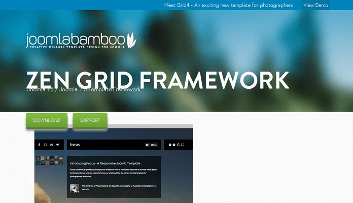
In addition to all of these responsive design features of Zen Grid, you can create custom fonts and colors for web pages. This framework contains an attractive interface with menus that are placed in more convenient locations. In order to give your users better access to your site, you have the option of fixing the navigation menu so that it always appears at the top of the page even as visitors scroll.
Admin controls prevent users from altering your template settings after you have spent quality time getting them the way you want. If your target audience is mainly comprised of mobile users, the Zen Grid framework is the perfect environment in which to design your site.
One extension that utilizes the Zen Grid framework is the Responsive CSS3 Slideshow. This tool gives you the ability to produce a parallax background effect on any of your pages. You gain the freedom to design a unique effect where the background moves at a different rate than the single slides when scrolling.
You control the speed, background color, and slides, and the effect is fully responsive for the best display on any device. The CSS3 animation is backward compatible so that visitors using older browsers can still enjoy the attractive display.
Responsive Templates
As the name implies, Responsive is a Joomla template designed for multiple types of end-users. To accommodate your diverse users, you can choose between fixed-width, percentage, and responsive layouts for each page. It is easy to change colors and replace fonts when designing your desired website. The attractive interface of this template makes it more enjoyable to use the framework.
You can even create offline pages for users to view while you are working on the site design. Responsive tools include the ability to hide modules on mobile devices and localization for a customized user experience. Since many mobile users stay connected on Twitter and Facebook, this template supports the most popular social media links.
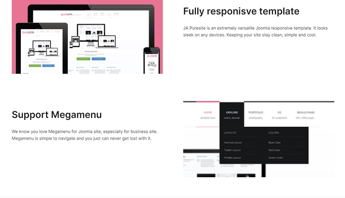
Puresite
If you would like to maintain a professional image, Puresite is an ideal Joomla template to use. The responsive designs are simplistic without any complex distractions that may take away from your message. The web pages will have a clean appearance on any device to offer a simple user experience with just the essentials.
Music Free
On the other hand, there are lots of Joomla templates for designing more creative pages. Music Free is a responsive template that caters to the artistic designer. This template is from GavickPro and is the perfect tool for creating artists’ homepages, music blogs, and music-orientated retail sites.
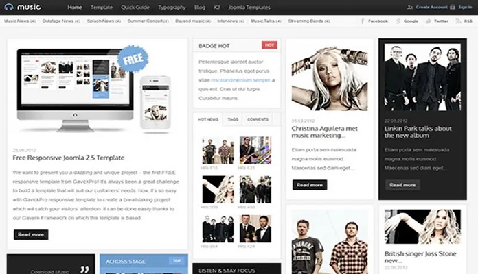
Based on your target audience’s tastes, you can craft a graphically attractive site that music-aficionados will love. The template utilizes responsive design for impressive displays on any device and cross-browser support for all modern browsers.
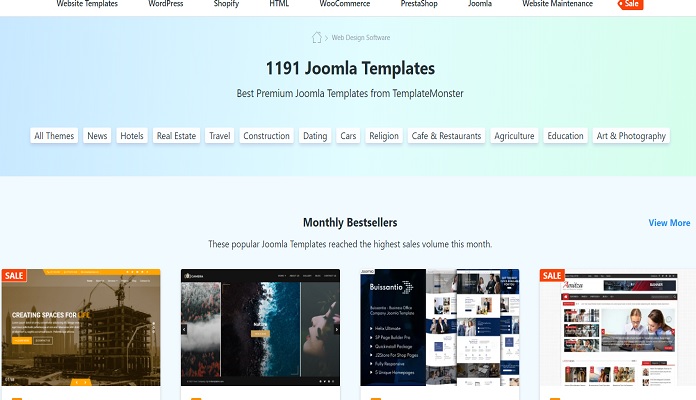
A great multitude of Responsive Joomla templates is proposed by TemplateMonster. Here you can choose a template in accordance with your business needs. A big choice of various categories, design solutions, and color schemes will simplify your task proposing the quickest way to get online making the most of all those benefits written above concerning Responsive Joomla templates.
Besides, there is a great proposition which you can use to practice your skills and study the product before buying it. Free Responsive Joomla sample is a perfect possibility to learn more about Joomla and its peculiarities, whether it meets your demands and requirements. Just download it and check the theme in action.
Responsive Web Design Interactive Guide
Responsive Design remains one of the hottest topics involving its absorbing world of possibilities and sometimes surprising with the speed of its increasing popularity. Nevertheless, it is difficult to find one resource which will be able to give you exhaustive information in a clear and easy perception manner without making you bored or even scared because of that incredible informative base which may seem to be a whole universe too big for one person. Let’s calm down and discover such resources!
Bright and original, it will help you clarify lots of aspects in a brilliant game form. Responsive Web Design Interactive Guide will become your reliable way to the desired knowledge. Helpful material about Responsive Web Design added with 15 blog articles, 5 quotes, 11 free PDF books, Google recommendations, 65 tutorials, 20 plugins, 19 tools. Some examples of Responsive Website Templates will present necessary information independently or as a reaction to users’ clicks, scrolls, or hovers.
All You need to do is to follow the road where each cell has some specific symbol: a light bulb, book, quotes, graduate’s hat, and toolkit icon – just click and find out what is hidden there. From now on Responsive Design will share with you all its secrets and benefits.
The need to access the Internet on multiple computers and devices continues to grow, Joomla offers various opportunities for designers and developers to create responsive websites. On a regular basis, CMS releases new tools to help web designers reach their web building aims.